
 Facebook
 X
X
 Pinterest
 Copy Link
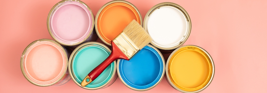
Every year, color forecasters and paint companies bring a burst of fun to the industry when they release their color of the year. Another perk is their creative language to describe the colors and the mood they’re trying to evoke.
Companies have started rolling out their 2024 color picks, and sharing the news can be an opportunity to reconnect with clients who may be ready for a fall or early winter refresh of their homes.
There are options for clients willing to embrace trendy, bold colors and hues for those who prefer more subtle changes and a timeless feel.
Evoking Emotion
In picking colors and names, the companies have drawn on consumers’ current mood and desire for tranquility, calm, and a break from the stresses of daily life.
For example, Renew Blue , Valspar’s 2024 pick, is “a nourishing, green-influenced blue that creates a sense of peace wherever you place it.”
“Most of us are seeking an end to feeling overwhelmed – less stress, less information, less technology, fewer choices. Simplicity. Here, we can slow down and create the peaceful place we seek,” notes Valspar when discussing its choice.
Sherwin Williams took a new direction with its Anthology: Volume One, choosing four color groups: blues and greens, reds and purples (colors include Rhapsody Lilac, Fireweed, and Dragon Fruit), deeps and darks (Mossy Gold, Roycroft Bronze Green, and Gale Force are among the colors), and delicate tints.
“In an era where well-being is increasingly important, dark colors can offer solace and soothe anxieties. Since 2020, deep-value tones have become synonymous with sanctuary, nurturing, and artisanal touches,” says Sue Wadden, Sherwin-Williams’ director of color marketing.
Behr’s pick, Cracked Pepper, is described as a versatile soft black that accentuates the spaces you create life moments in, while Dutch Boy’s Ironside is “a deep, comforting green that is a richly dimensional hue that soothes and reassures.” Dutch Boy developed three palette categories—Embrace, Retreat, and Inspire—that pair well with Ironside. They include Strawberry Shake, Whale’s Tail, and Pineapple Flan.
If you know clients are looking for a reset, they might be receptive to chatting with you about color trends. Others could be contemplating a vacation property or new home to find a change of scenery, a retreat, and less stress.
